Quick Navigation:
| | |
Statistics
Introduction to Graphical Representation
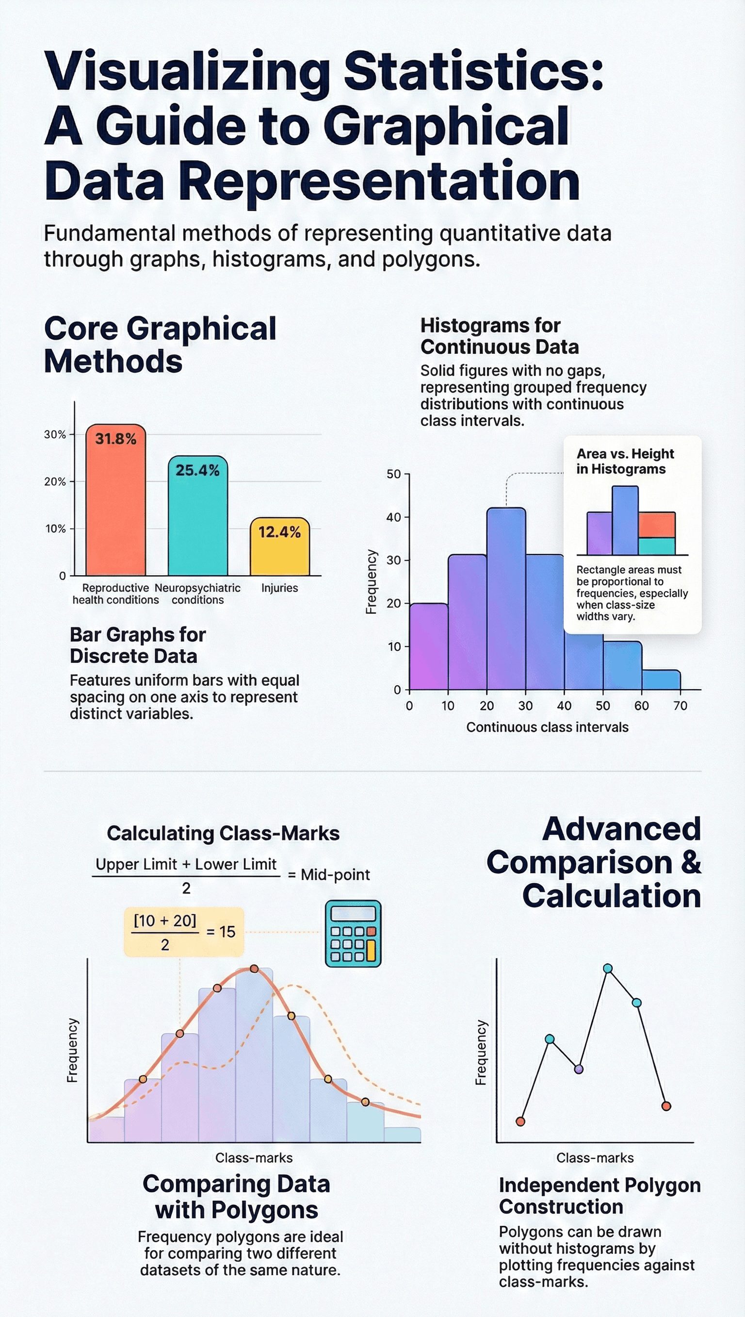
- • Graphical representation is often easier to understand than tabular data, as comparisons between individual items are more visually apparent.
- • The chapter focuses on three primary methods: Bar Graphs, Histograms, and Frequency Polygons.
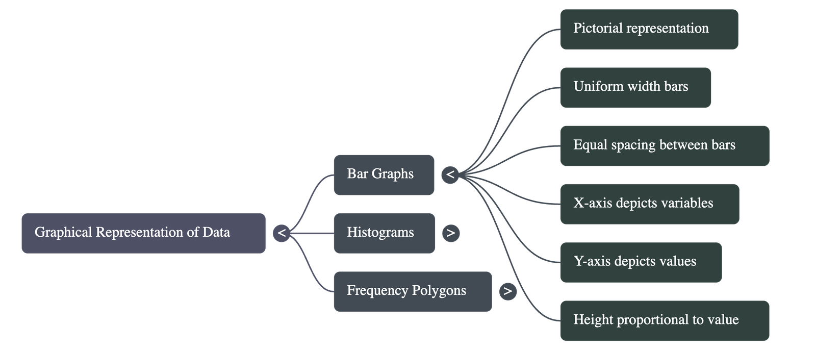
1. Bar Graphs
- • Definition: A pictorial representation where bars of uniform width are drawn with equal spacing between them.
- • Axes: Usually, the variable is shown on the x-axis and the value of the variable (frequency) on the y-axis.
- • Construction: The height of each bar is proportional to the value it represents. The width of the bar is arbitrary but must be consistent for clarity.
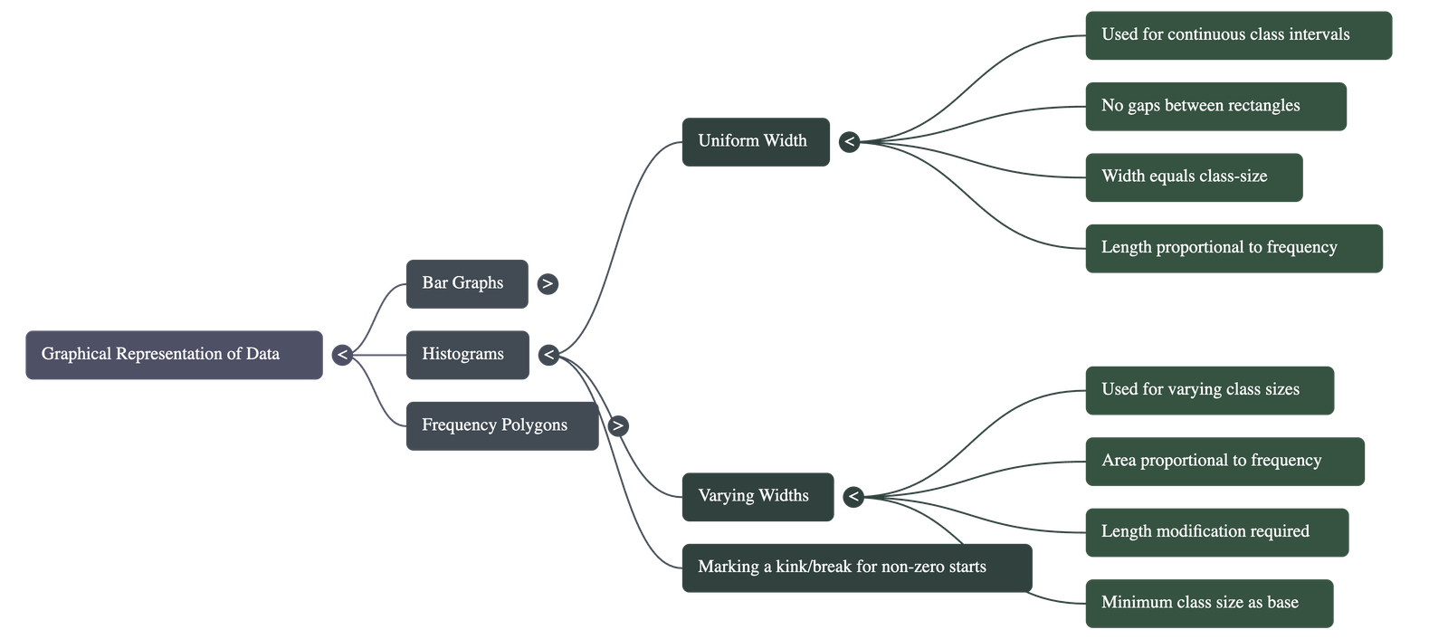
2. Histograms
- • Usage: Used specifically for grouped frequency distributions with continuous class intervals.
- • Characteristics: Unlike bar graphs, there are no gaps between the rectangles, creating a solid figure.
- • Uniform Width: When class sizes are equal, the lengths (heights) of the rectangles are proportional to the frequencies.
- • Varying Width: If class intervals have different sizes, the heights must be modified so that the area of each rectangle is proportional to its frequency.
- • Kink/Break: If the first class interval does not start at zero, a "kink" or zigzag mark is placed on the horizontal axis to show the break in scale.
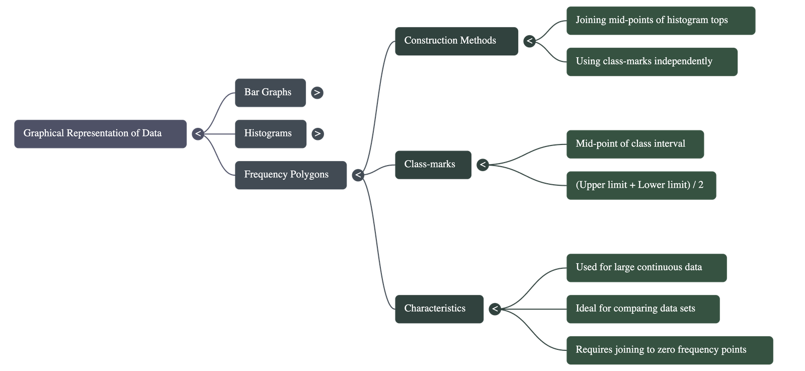
3. Frequency Polygons
- • Method A (with Histogram): Created by joining the mid-points of the upper sides of adjacent rectangles in a histogram with line segments.
- • Method B (without Histogram): Drawn by plotting points using class-marks and frequencies, then joining them.
- • Class-Mark Formula: (Upper Limit + Lower Limit) ÷ 2.
- • Closing the Polygon: To complete the figure and ensure the area remains the same as the histogram, mid-points of imaginary classes with zero frequency (one before the first class and one after the last) are added.
- • Utility: Highly effective for comparing two different sets of data of the same nature (e.g., comparing the performance of two different school sections) on the same graph.
Summary based on Chapter 12: Statistics
Quick Navigation:
| | |
1 / 1
Quick Navigation:
| | |